Categories
Design

The Digital Divide is (also) a web design problem

By now it is very likely that you’ve heard the term “digital divide” being thrown around in discussions about equalizing access to computing technologies and the Internet. This term is specially relevant now in the current global context. The COVID-19 pandemic has shone a light on the vital importance of virtual, over-the-internet experiences to ensure continuity in crucial economic and social activities (remote work, e-commerce, banking, food delivery, live-streamed events, etc.)

It is clear that the economic and social effects of the pandemic would have been much, much worse had it occurred at a time in human history without accessible broadband internet access, mobile phones and innovative web technologies. Yet there is still a substantial portion of the human population, about half of the world, without the privilege of having affordable access (or access at all) to the Internet.

Something I’ve noticed is that the digital divide conversation is often discussed as a hardware problem. Experts are either laser-focused on finding affordable ways to build the physical infrastructure needed to establish connectivity, or talking about how Moore’s law and cost-effective manufacturing materials can yield capable and affordable mobile phones for emerging markets. Though the discussion around hardware innovation and access is critical, it eclipses the other half of the problem: software.

Hardware is built to run software. And regardless of how available internet access becomes, if the software is inefficient or unnecessarily bloated, it will offset the capabilities of the hardware.

Categories
Design UX

From UX to EX: Designing Great Employee Experiences on your Corporate Intranet

In the world of human resources, there’s the so-called Employee Experience (EX). This relatively new term refers to the all the continuous improvement with interactions and touch-points an employee has with the organization, specially with its corporate services (think HR services, IT services, corporate facilities, etc.) In theory, the better the employees’ experiences with these services are, the happier and more engaged they will be.

Still with me? Great.

If you think about it for a moment, these two terms have a lot in common and it’s not just the fact that they both compress the word “experience” to a letter X. No, what’s fundamentally similar is that the two concepts are about empathy, about putting people first. I like to think of them as the countermovement to the “bottom-line”. In our efforts to create efficiencies, to scale, to streamline, to standardize, and mass produce, we have forgotten about people. We create things because “that’s what the business wants”, but often fail to consider if “that’s what the customer needs”. So, given that these two concepts are fundamentally similar, what if we merged them in such a way that it is useful to address this disconnect between people and digital/organizational processes?

A framework is born

Las year I was involved in a huge website redesign project for the HR department of a large multilateral organization: the Inter-American Development Bank (IDB). We knew that the website had to be migrated to a more modern CMS platform, that we needed to have a “mobile-first” approach in development, and that we needed to catch up with new HTML5 standards. That was all well. However, I wanted to go beyond improving the technological infrastructure.

I wanted to use this redesign project as an opportunity to make HR knowledge less HR-ish. You know what I mean; less paperworky, less verbose, friendlier, smoother. In an attempt to compensate for the inescapable realities of the function’s inherent bureaucracy, I thought it was time to use UX design as the philosophy powering the content and interface design strategies of the website.

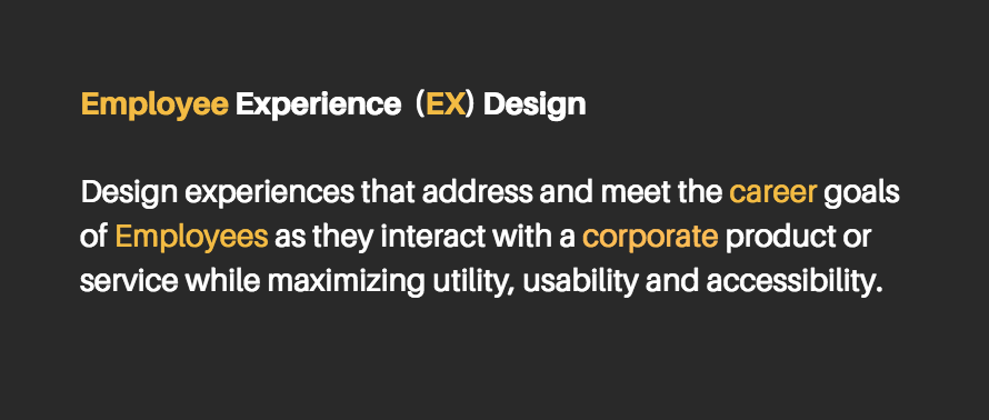
And so a framework was born: Employee Experience Design. I simply merged my experience and passion for UX design with the needs and goals of the employee. This wasn’t so much a tested methodology, but a perspective shift in our daily work on the project. The framework made everything much more concrete and focused. Now our team could make informed decisions about content strategy and information architecture concerns, taking the career goals of the IDB employee into account as its primordial source of value.

The new HR intranet website has been live for just three months at the time of this publication, so we’re still iterating on the effectiveness of some of our designs. However, I’d like to share with you three lessons we learned from the process that can help you create digital experiences for employees that are more fine-tuned to their needs.

Categories
Design Personal UI UX

What being left-handed taught me about inclusion & accessibility

If there’s something that being left-handed has taught me is how product designers often forget that we are also part of the user base; perhaps because lefties (~10% of world’s population) are statistically marginal.

In my recent talk at the Inter-American Development Bank titled The All-Inclusive World Wide Web, I show how blind assumptions about users’ circumstances on the Web can alienate and exclude those in the low-end of the tech market, and explain how the path to inclusion in software begins by designing and creating with empathy.

Watch it below…enjoy!

Categories
Design UX

Your Resume is Dumb: How APIs Could Improve the UX in Talent Sourcing

At the end of last year, I wrote up a post on LinkedIn about how sharing CV’s as static PDFs documents will most likely be regarded as a process of antiquity as the Internet Of Things infrastructure matures and robust API’s are developed for data transfer (perhaps facilitated by blockchain platforms) that enable the sharing of real-time career development data. I thought it was about time to share it here as well. 


What if our CV’s were smart? Think about it: no more boring, static PDFs, but dynamic web experiences that update themselves automatically, in real time, with new information about our professional and academic growth.

Sure, you have a LinkedIn. That’s great. It’s on the Web, it’s digital, it’s mobile accessible and, above all, its network-building algorithm has been great for you to connect with peers, colleagues and potential employers. In fact, the algorithm is so effective that it shows you “people you may know” that perhaps you did not even remember you did, and every week or so it automatically does a job search for you.

Yet, despite these technological advancements, our personal profiles mirror our PDF-bound CV’s in their dumbness: inert layered boxes where we manually input information when (and if) we remember to do so. Herein lies an opportunity to design a solution that could better communicate and mirror the ever changing nature in the “course” of our “life” or — to put it elegantly in Latin — in the Curriculum of ourVitae (see what I did there?).

via GIPHY

As the the information systems of the world move towards a mature IOT (Internet Of Things) infrastructure, I believe it inevitable, that in a not-so-distant future, your CV will transcend the confines of the PDF and become an autonomous interface powered by web services and APIs, fed by real-time data, and of course, protected by encryption technologies.

Categories
Design

The Type is Worth It

I’m the type of web developer who appreciates good type on screen. I mean, just think about it. Typography is such a mysterious design tool. Designers spend substantial time deciding on the right family, the right em size, the right kerning, the right leading, the right weight, etc. And yet, despite the effort and thoughtful decisions backing a well designed web page, most readers do not internalize the visual vernacular being transmitted through typography in every single heading and paragraph. Type, in a weird philosophical way, is visibly invisible.

Even though I think typography is crucial to good design, I must also admit that I, too, forget to consciously appreciate typographic decisions most of the time. Being part of the fast-consumption paradigm that rules the modern web has conditioned us to simply enjoy the hyperlinked nature of the internet; jumping from page to page we visit a site and a few seconds (or minutes) later we’re gone. Users (including myself) do not pause to admire ligatures and font contrast. They, we, just want to read– and fast.

https://flic.kr/p/q2RzMU