Table of contents
My Role in the Project
As the Digital Product Manager of the IDB Invest website, I had the role of the Product Owner in the Scrum Team that worked on the website redesign project. Being the Product Owner, I defined, prioritized and created a roadmap of performance optimization tasks that would be developed by a team of engineers.
In addition, since I’m an expert in web-technologies I identified quick-wins and long-term solutions to optimize the entire IDB Invest website.
Overview: Why Invest in Performance Optimization?
Before I take a deep dive on how I defined an optimization strategy, I’m going to take a step back and clearly articulate why I decided it was worth investing time, money and energy on this initiative.
Optimizing the website was an urgent business need for three main reasons:
1. Great User Experience (UX) is the New Normal
This is specially relevant now in the context of the global COVID-19 pandemic. As the world economy moves to a digital-first paradigm, good UX is not a “nice to have” anymore. It is a crucial component of any digital product.
Users react poorly to friction in any digital experience; that is, the amount of “resistance” in the usability of a product. Whether we’re talking about a poorly structured information architecture, or slow load-time speed, these design flaws add friction by increasing the cognitive load of the user. This encounter with friction can even affect your users physiologically, leading them to stress and anxiety.

The more you overload the cognitive threshold of your users, the more likely they are to abandon the experience altogether. This of course is bad for them (they did not get the content they wanted), and for you (you did not get the engagement that your product expected). As one study by Google showed:
The number of seconds it took for the full page to load—including images, fonts, CSS codes, etc.—had the most impact on whether a user would stay on a mobile site. We found the median mobile website load times for bounced sessions were about 2.5 seconds slower than nonbounced sessions.
Source: Google – Why Marketers Should Care About Mobile Page Speed. 2016
Great UX is an added layer in your product or service’s value proposition and a key differentiator in being able to connect effectively with your target audiences.
2. Poor Loading Performance Will Affect SEO Signals
The modern web has matured enough to support rich, multimedia experiences in an accessible way. If you design and engineer your website or app using best-practices, you should be able to ship a product that is sophisticated yet light-weight enough to be accessible in different contexts (i.e. smartphone devices, network-speeds, etc).
Google knows this. As a champion of web performance, the search-engine giant is implicitly “forcing” companies to make sure their websites adhere to “Core Web Vitals“. These web vitals, are a new standard, according to Google, that websites should meet in order to provide a decent website experience. One of these vitals is, of course, load time performance.
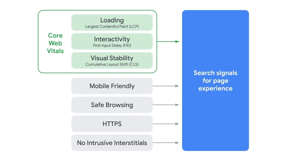
Starting in June of 2021, the company announced that its page ranking algorithm will start considering these core web vitals as a quality signal. In short, poor page load time will affect its position in Google search results.
3. Let’s Be On-Brand: Help Close the Digital Divide
This argument is about finding genuine alignment between IDB Invest’s values and mission with its online presence.
The IDB Group as a whole often talks about closing development gaps; whether they are about gender, health, infrastructure, or financial resources, Development Banks aim to close these gaps to foment sustainable economic growth. But what about internet connectivity gaps?
As I’ve written in blog posts before, the Digital Divide is not just an infrastructure or hardware problem. It is a software problem as well. Without efficient web design, good connectivity solutions can be offset by bad, heavy content.
I posed the question: How much does it cost for users to visit our website?
One must be aware of the fact that even though websites can be cost-free to access, connection to the internet is not. The Internet is made up of data: bits and bytes. And users, specially in developing countries, pay for their access to the internet by the megabyte or gigabyte.The heavier a digital product is, the more cost it will incur on the data plan of the user.
As the product manager of the platform I saw this as an opportunity to show how we can lead by example and practice what we preach.
The Strategy
Research Phase
I always begin projects with some preliminary research. Before coming up with solutions, it is very important that I gather as much information I can on the problem domain and its current conditions.
I began with a quick audience analysis using Google Analytics, and then performed a baseline measurement of how heavy our most trafficked web page (the Home page) was and how much it cost to download in our stakeholder’s region.
User Analysis
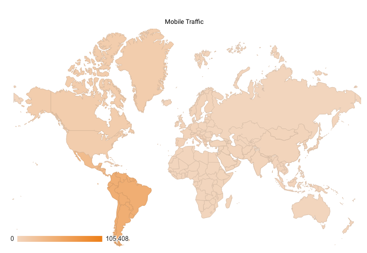
Even though the core of our users visit us on a desktop computer, mobile traffic increased 198% in the past year, with most of it coming from our main stakeholder region: Latin America and the Caribbean (LAC).
Mobile traffic increased 198% in our main stakeholder region.
33% of traffic (1 out of 3 users) visits the website on a mobile phone. And out of that third in our traffic, 77% comes from a user in the LAC region.
Baseline KPI Measurement
In addition to a user and traffic analysis, I wanted to measure the weight of the most trafficked and webpage on our site: the home page. The home page was the perfect candidate to pilot the optimization strategy before deploying it site-wide. This for 2 reasons:
- It is the most visited page, and therefore will have the most impact if the optimization strategy is successful.
- This page contains a lot of content, specially images. If I find a way to reduce the data footprint of this page substantially, then all others will be easier to deal with.
I used a useful web application approporiately called: What Does My Site Cost? This tool measures the weight of any web page you input, and then using data from TCU and the World Bank computes a value in USD of how much it costs a user to visit your page on mobile networks across the world.
I ran the home-page through this tool, filtered the data by countries the Latin America region, and got the following results:
| Country | Cost per visit – Home Page before Optimization (7MB) |
| Brazil | $0.59 USD |
| Mexico | $0.21 USD |
| Colombia | $0.15 USD |
With this information I had a solid baseline against which I planned to measure the web performance KPI. Also, from this information, I set an ambitious target:
Target: Find a way to reduce the home page weight by more than 65%
This target would get the page below the 3MB threshold, which is more in line with the average page weight of ~3MB, according to Google’s data:

.
Strategy Tactics
Given time and budget constraints in the project, I decided to focus the tactics of the strategy on the low-hanging fruit: image optimization.
Images add the most bytes to any digital experience; and in pages such as our home-page they make up most of the content. Yet these images and content are non-negotiable. I couldn’t just get rid of them. Images are how we make content engaging, and how we express our brand. I had to instead focusing on reducing weight without getting rid of imagery.
Sow how did I achieve this? By adhering to the following tactics:
1. Goodbye JPG’s, and PNGs. Hello, WebP!
We have adopted WebP as the default image format for the website.
WebP is a modern image format, specially developed for the Web, that provides superior compression for images. WebP lossless images are 26% smaller in size compared to PNGs or JPGs.

And I went a step further. Working with the team, we have automated this conversion process at the CMS Level meaning that web content editors upload JPGs and PNGs, and our system (Drupal) converts and outputs the WebP. variant.
2. <picture> Element to the Rescue
The picture HTML element basically allows us to tell the browser which version of the same image to load depending on a specific set of rules or conditions.
This allows us to serve images responsively; meaning that we load images that are appropriately sized and cropped for the device the user is visiting us on.
And with this we can also circumvent the WebP browser-support problem (Internet Explorer does not support WebP images). If the user is visiting us on a device or browser that does not meet any of the rules specified, we show them a fallback image in a more traditional file format (JPG or PNG) .
3. Using SVG for Icons and 2D illustrations
I performed an audit of all icons and illustrations in the home page, and set them up to be converted from traditional image formats (JPG, GIF, PNG) to Scalable Vector Graphics (SVG).
SVGs can be exported as code that developers can embed directly in the HTML document. The browser then simply draws the image from the coordinates in the code. This makes it super efficient to render these images on the screen because A) Computers are great at parsing code quickly, and B) the browser does not need to download and image from a server somewhere, which saves data for the user and reduces latency.

4. Lazy-load all images below the fold
Lazy-loading is a UX pattern where we only download the images as the user scrolls down the page. In other words, we code the page to show our users only the images we know they have to see at any given moment in the experience.
If users do not scroll down and come close to the images’ location, we save them data by not loading them. This is a seamless and fluid interaction; in fact, it is virtually unnoticeable for the end-user. The browser detects the user is approaching the off-screen image’s location area and loads it just in time before the user gets there.
Lazy-loading in action
The following video shows how this solution works. On the left you see how I’m scrolling through a series of pictures. On the right side, you see the browser’s built-in console. This console logs a record of the images it downloads the moment it does so. As I scroll you’ll notice how the console is logging the image downloads.
Without lazy-loading, all images would have been downloaded as soon as possible, almost at the same time. With lazy-loading, the images are loaded progressively and only on a need-to-see basis.
Leveraging Native Lazy-loading
The lazy-loading pattern is nothing new. It has existed for many years as a way to implement image-heavy web designs in a performant way. Yet, until very recently, this pattern depended on the installation of external software libraries. These libraries add dependencies to the solution and bytes to the data payload that is transferred to the user; certainly not the best scenario for reducing page size.
Nowadays this functionality is native to the HTML specification, and is ready to use out-of-the-box on modern browsers. What’s even better is that it’s very simple to implement! All is needed is to add the attribute loading="lazy" in the <img> tag and it is done. The browser takes care of the complexity for you.
<img loading="lazy" href="https://urltomyserver.com/image.webp" height="100" width="100" />The Outcome
The results were very positive. By focusing on an image treatment strategy, I was able to reduce the weight of the home page by ~70% (From 7MB to 2MB). This made the website 3.5 times cheaper to download in mobile networks in countries in our stakeholder region of Latin America.
| Country | Old Home page (7MB) | Optimized Home page (2MB) |
| Brazil | $0.59 USD | $0.17 USD |
| Mexico | $0.21 USD | $0.06 USD |
| Colombia | $0.15 USD | $0.05 USD |
Given the success of the strategy, I will implement these same tactics to all pages on the website to make it a complete light-weight experience.