I’m the type of web developer who appreciates good type on screen. I mean, just think about it. Typography is such a mysterious design tool. Designers spend substantial time deciding on the right family, the right em size, the right kerning, the right leading, the right weight, etc. And yet, despite the effort and thoughtful decisions backing a well designed web page, most readers do not internalize the visual vernacular being transmitted through typography in every single heading and paragraph. Type, in a weird philosophical way, is visibly invisible.
Even though I think typography is crucial to good design, I must also admit that I, too, forget to consciously appreciate typographic decisions most of the time. Being part of the fast-consumption paradigm that rules the modern web has conditioned us to simply enjoy the hyperlinked nature of the internet; jumping from page to page we visit a site and a few seconds (or minutes) later we’re gone. Users (including myself) do not pause to admire ligatures and font contrast. They, we, just want to read– and fast.
This fast-paced paradigm has sparked a lively and honorable movement from part of the web development community to adopt a philosophy best exemplified by the Twitter hashtag #perfMatters, or “Performance Matters”. This of course has always been a cornerstone in computer science. We strive to bring users fast software and fast hardware. We upgrade our mobile phones and computers with faster clock speeds and we strive to deliver digital experiences as fast as we possibly can. It’s just the obvious progression. Fast is good. Slow is bad. And I could not agree more. Slower websites have higher bounce rates, and faster websites have happier visitors. Makes sense.
Consequently web designers and developers alike began to build for the modern web with performance and mobile deliverability in mind. Visual assets had to be weighed against a performance budget, and Type as a design asset has been one of those visual assets that has often been deemed as superfluous and thus sacrificed in order to deliver a faster experience.
This assets vs. performance discussion briefly took place last week on one of my favorite podcasts, the Shop Talk Show. As a guest they had Tim Brown, who is the Type Manager for Adobe Typekit. During the show Co-Host Dave Rupert admits to the tendency for performance-oriented developers (a.k.a responsible developers) to put type at the end of the performance budget. And with good reason. Sending several families of one Type can take up several kilobytes being sent down the wire which could take a bite (I love puns) out of a perfectly performant website.
For this reason some developers and designers restrict their websites to the sole usage of “system” fonts which are readily available to the user’s browser from the computer’s default font library. Helvetica on OSX, Arial on Windows, Georgia, Verdana, etc. are the so-called “web-safe” fonts as they will be rendered immediately and (almost) consistently across all clients and without any extra HTTP requests needed.
Tim, however, stressed how important type is on a website. Not only does a typographic stylesheet help establish a cohesive brand identity for your product or company, but type has a very emotive and evocative role: type sets the mood and the tone of the design. Just like a melody evokes a different sentiment if played with piano versus a pipe organ, light weights in a font can evoke a sense airiness and delicacy whereas a thick condensed heading can express authority and boldness. At around minute 18, Tim says:
“Body text is very valuable… it sets the tone for your whole website. It’s the kind of thing that people don’t notice of the top of their heads… I usually give an analogy of people at a café. The way furniture is arranged might give people a really good feeling but they might not see it as somebody having arranged the furniture for somebody to feel that way”
These emotional invocations conjured by typography are indeed a crucial part of the psychological experience that happens when we interface with a digital product and thus should be prioritized as much as the load-time experience.
So how do we compromise? TypeKit’s on it
As a user and fan of TypeKit I fully appreciate the steps Adobe has been taking in order to make developer’s life easier when building for the web.
For example, Tim mentions that TypeKit has implemented a method named Dynamic Subsetting. This method uses JavaScript to parse through a web page and dynamically serve only the characters of the font family that are being used, hence delivering only a “subset” of said font-file. Dynamic subsetting has not been fully deployed fully in the TypeKit platform; it can only be used for East Asian characters BUT there’s a hack you can do in order to unleash dynamic subsetting on your website today which Time mentions around 22:18
Don’t have TypeKit? Don’t Worry! This subsetting technique has been around for some time and you don’t need TypeKit to do this work for you. In fact, you can do it manually. It’s not dynamic and fancy, but it can be incorporated if you want to shave some bytes off.
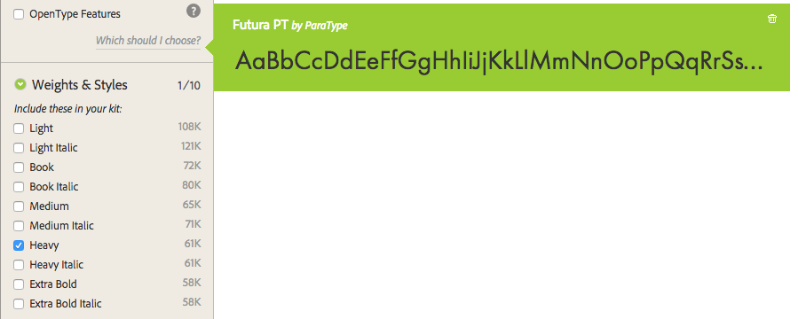
TypeKit also helps you manage the byte-size of your font assets by letting you know how many kilobytes of data need to be transferred down the wire for a particular font-style (as illustrated above.)
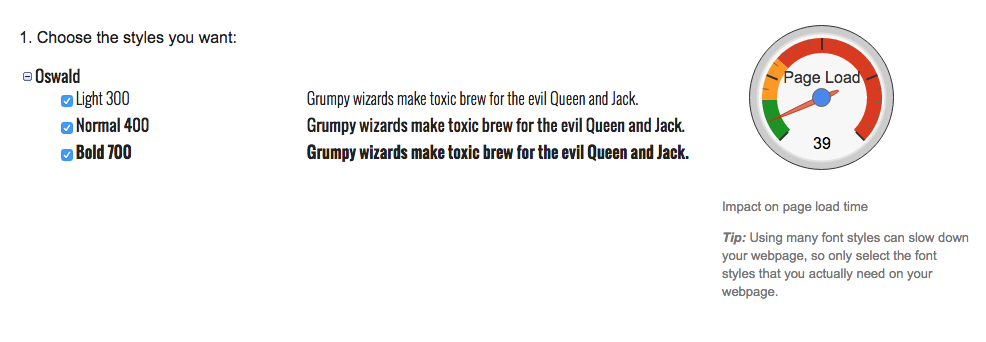
Again if you don’t have TypeKit and want to go the free route, Google fonts also uses a visual “meter” that lets you know what the performance impact will be by including different weights of a font family.
Conclusion
Despite how cool type can be, we are still left with the same, inevitable, dreaded diagnosis: delivering custom type is not free. It will always cost your performance budget something, no matter how tiny the font file(s) you decide to use are. We can however, learn to balance our budget more effectively by compressing and lazy loading images, minifying and concatenating scripts, and limiting the font styles within the type families used. It doesn’t have to be an all-in-or nothing situation. Fast websites can also be beautiful.
So is type really worth it? Is it worth the 200+ K of overhead data? I think so. I really, really do. After all, type is the visual embodiment of the core feature in your app or website — your content.