This project is still under development. This page will be updated accordingly as the project evolves in scope and deliverables.
Project Overview
Design has often taken a back seat in the product development process. Often, an application or website’s design is considered purely on the basis of aesthetics and branded elements, but in many organizations it is rarely seen as a core part of the software delivery worfklow.
A design system helps operationalize the design practice by ensuring standards are adhered to, and best practices are followed. The more robust this design infrastructure becomes, the easiest it will be for developers to build UIs; This in turn makes it easier to scale in software.
Table of contents
Objective
Problem Domain: How might we operationalize design as a function of software development? And how can we scale the design function given our limited resources?
Our objective for this project is to create and establish a standard for the UX and UI design of business applications and tools at IDB Invest so that developers and designers can quickly build and design UIs with well-tested and documented components.
Users and audience
1. Developers
In the past, a lot of my time as a UX designer has been focused on assuring that the quality of the UI’s built by our developers meet my very own, opinionated expectations of what “best-practices” we should follow. This worked for a little while, but as I became involved in an increasing number of projects, and my time became increasingly scarce, it became clear the time had come to create a centralized, documented repository of design guidelines and well-designed web components to help developers iterate quickly on their front-end work without constant touch points with me.
2. Designers
Due to the lack of well established guidelines, designers often solely rely on the organization’s brand guidelines to create the visual experience of an app or system. This results in a (somewhat) consistent visual identity — color palette, icons, logo, font family — being applied terribly inconsistently: button styles are varied, primary colors do not coincide, font sizes are not applied with consideration, etc.
Having UI and UX guidelines, supported by the already defined brand identity, will provide designers a common and consistent UX design vocabulary, a library of components, and the resources needed to create netter design prototypes faster.
3. Web masters and marketers
At the end of the day, we want our technology solutions to empower the users who maintain and produce the content and information that is rendered in the UI of our products.
By defining clear design guidelines and building reusable components into CMS platforms, web masters and marketers will gain the knowledge of how to use the right component for the information they want to communicate, and can focus their efforts in creating quality content rather than struggling with the CMS software.
My role in the project
As lead UX designer in the team, I proposed the idea to IT management of implementing this design system. Once the initiative was approved, I then worked with a visual designer on the team to define the aesthetic qualities of the system and design each component in our Forma library. Throughout the project’s lifespan, I have directed the UX design approach of the system, ensuring we don’t deviate from our accessibility and performance standards.
Design Process
1. Visual audit and research
To kickoff the design process, we first studied IDB Invest’s Brand Guidelines, as these would be a crucial input to guide the system’s overall look.
Then we did a visual audit of all the systems and apps that are in active maintenance at IDB Invest, in order to ascertain which type of UI components are the most used, and the type of UX patterns that have been implemented and are familiar to our users.
2. Define core attributes
We began with defining a typography scale (in pixels) that would communicate content hierarchies effectively
Then we set out to define a broad color palette, leveraging all the primary and acent colors defined in the brand guidelines. We used each of these colors as the “base” and then created a gradient for each, defining 8 additional hues per base color (4 darker, 4 lighter). The Color palette provides a range of accessible combinations, which pass contrast ratio accessibility tests to accommodate users with visual impairments.
We later defined a depth system (3 levels of depth), that outlines the CSS shadow styles that are to be used when stacking UI components over each others.
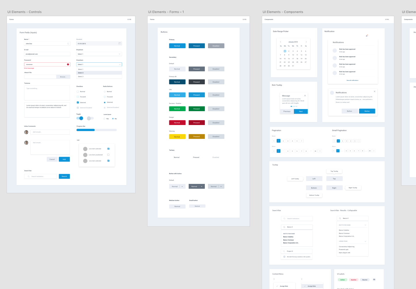
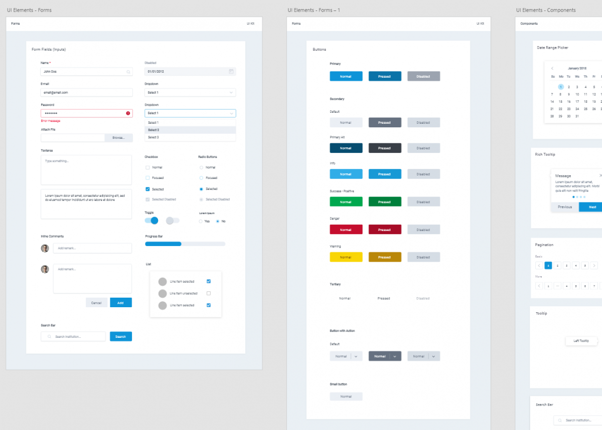
3. Design and test components
With the core characteristics of our system well-defined, we set out to design basic UI components (Form fields, buttons, modal windows, checkboxes, etc.), which we later test to see how each of these components interacts with each other in the context of real user interfaces.
This process was and still is highly iterative. As we design user experiences for IDB Invest’s financial system, we often realize that 1) we need to design a component we had not foreseen, 2) we have overlooked a component’s visual characteristics for a particular application state, or 3) an edge case comes to light that would necessitate the creation of a subvariant of a particular component.
Outcomes
- Front-end developers and UX designers (myself, in this case) can quickly design, build, and deploy experiences given the modularity and resuability of our component-based UI architecture.
- The QA team has a canonical source of truth in the form our design system documentation. They can use these design specs to easily test the quality and consistency of the system’s UIs.
Lessons learned
1
Do not forget about component state. If you design a component, as basic as it may be, it will probably require you to define how the component will look and behave when the application state is updated (processing, disabled, empty, error, warning, success, etc.)
2
A component library IS NOT a design system. We quickly realized that documenting our components, colors, type scales, etc. were half the battle. Once those are developed, it is imperative to provide guidance (in the form of documented guidelines) to users of the design system on when, how, and why they should use of a particular pattern or component.
3
A design system is (almost) never finished. As new scenarios are uncovered, and substantial user feedback is gathered, tweaking aspects of the system become inevitable.