Overview
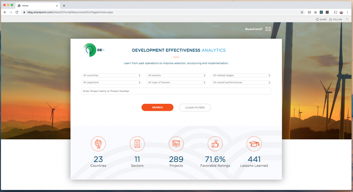
The Development Effectiveness Division at IDB Invest created a knowledge portal called Development Effectiveness Analytics (DEA), with the purpose of disseminating crucial information about the development impact of IDB Invest operations and lessons that were learned after the completion of the project.
Before joining the product team, an MVP of the DEA portal had been developed, but the users were dissatisfied with the result. My role as then to iterate on the MVP focusing on increasing the UX satisfaction.
Table of contents
Objective
Problem Domain: How might we redesign the current DEA MVP in a user-centered way, so that we deliver an effective, useful and usable knowledge tool?
Users and audience
1. Development effectiveness officers
At IDB Invest, Development officers are in charge of evaluating the effectiveness and the development impact each of the organization’s transactions is managing. Their work is imperative in carrying out the core mandate of the organization, and having a platform in which they can publish and distribute their institutional knowledge to the entire enterprise is vitally important.
2. Investment officers
Investment officers working in the supervision stage of each of IDB Invest transactions, require access to institutional knowledge on development effectiveness in order to make informed decisions while they monitor the development commitments clients have agreed upon.
My role in the project
In this particular task, given that an MVP/prototype was already developed, my role was that of a user experience researcher.
I had to analyze the existing product, and investigate the reasons why it was failing to fulfill users’ needs. My deliverable was not merely a broad list of user insights, but an actionable plan with which we could implement a redesign.
Design Process
1. User Interviews
First, I had to find the root cause of the users disatisfaction with the MVP, and so I set out to interview a diverse sample of 7 core users (investment and development effectiveness officers) of varying seniority levels, tech-savyness, age, and gender.
Using the “5-act” interview process outlined by Jake Knapp in his Design Sprint book, I asked them to walk me through the current MVP and “think out-loud”; I wanted them to voice their reactions and feelings about the tool as they used it. As they answered my questions I recorded their thoughts and sentiments in my insights notebook.
2. Affinity mapping exercise
After the interviews were over, I paged through all my insights, recording each insight onto a digital sticky note and using the Miro software to create a virtual “insight wall”.
First I grouped my insights under the question in the user interviews that brought such insight to light:
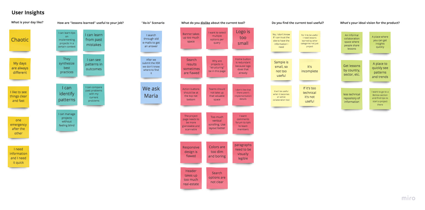
The affinity mapping is a great way to uncover patterns in the data in a very visual way. You can almost sense a heat map-like structure starting to form as you group the insights together by their commonalities.
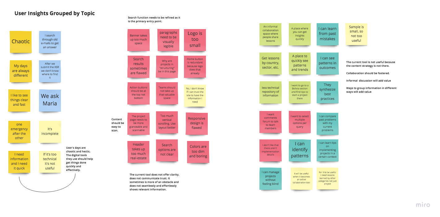
3. Insight statement definitions
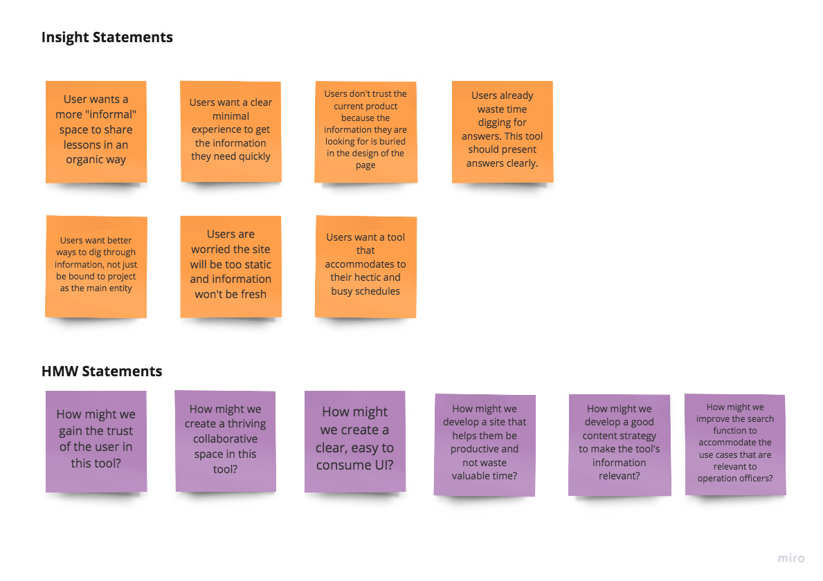
As insights were clustered into topics, patterns began to emerge and clear, actionable insight statements were jotted down. These insight statements put into focus the real problems behind the MVP that was previously developed.
If you are a designer like me, you see problems not as obstacles but as opportunities for creating innovative solutions. Which is why whenever I present my research findings to clients, I never show them the raw insight statements, but the optimistic How might we? statements (often evangelized by IDEO), which put the problem on its head and communicates design opportunities in a very inspirational tone.
4. Redesign plan
After the affinity mapping exercise, some pain points were clear:
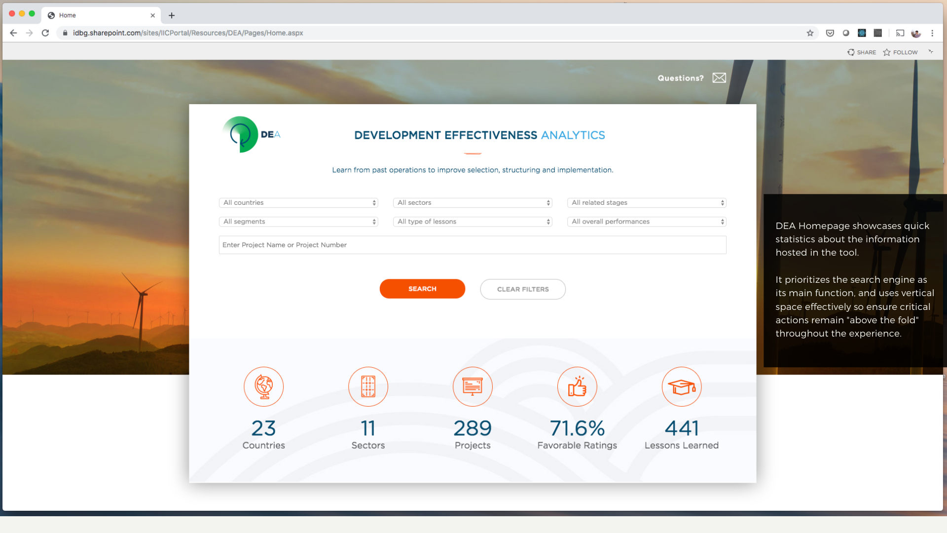
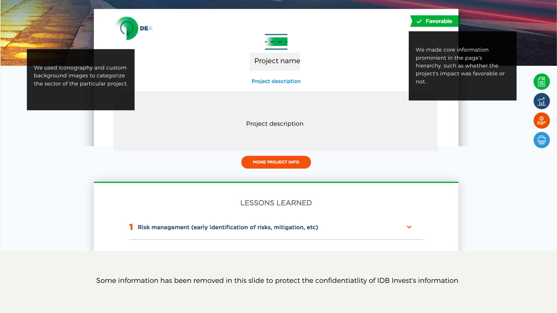
- The site needed to display content hierarchies more effectively, bubbling up essential information to the top of the page, or making it more prevalent.
- Vertical space needed to be used effectively. Remove all design elements that are purely aesthetic and focus on content delivery.
- Make the site “scanneable”. Leverage color and iconography to make dense content easier to scan by the users.
Outcomes
- A redesign plan was put into effect which improved the website greatly in terms of usability, information hierarchy, and layout.
- The product owners were extremely happy with the redesign. They were also impressed we could conduct user research and deliver a proper user-centered redesign in less than 2 weeks.
Lessons learned
1
Without user input, your Minimum Viable Product is just a Minimum Product. It was a mistake for the former project lead to deliver an MVP without having tested earlier, low-fidelity prototypes before hand.
2
Users don’t care about the tool itself, they care about the information or experience the tool can provide for them and their needs. So design to maximize utility and minimize friction between user and content.
