Now that a lot of us are working remotely amid the COVID-19 outbreak, I’ve been ruminating on how we can make the best out of this highly disruptive situation. Naturally, I began looking at this problem through the lens of a “design thinker”.
After giving it some thought in the past four weeks of remote work, I have condensed what I’ve learned into five tips based on design thinking mindsets and techniques. I hope they can teach you something new about UX design while also helping you cope with the uncertainty and chaos of our current situation.
1. Reduce your cognitive load by uncluttering your work space.
You’ve probably heard this before: “A clean space is a clean mind”. It is somewhat of an obvious truth by now, as I’m sure we all have experienced the clarity and the mental lightness that comes rushing in after we have made our bed, organized our closet, or tidied-up our desk. And yet, having a “clean mind” is about so much more than simply feeling better. It is also about doing better.
As obvious a fact as this may be, there is well established literature in the field of cognitive psychology that has studied how external input affects our ability to focus, absorb, comprehend, and retain new information. It is precisely out of this field in psychology that this idea of humans having a finite cognitive load emerged. That is, the amount of working memory available to us to process and digest information at any given moment.
In UX design, it is very important to clean up the user interface (UI) of a website or app as much as possible to ensure the user can focus on the most important actions and content on screen. By keeping the experience clean we minimize the user’s cognitive load and maximize their cognitive resources available to fulfill the task they are carrying out.
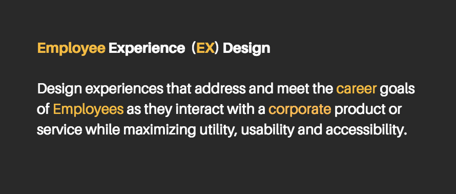
In the world of human resources, there’s the so-called Employee Experience (EX). This relatively new term refers to the all the continuous improvement with interactions and touch-points an employee has with the organization, specially with its corporate services (think HR services, IT services, corporate facilities, etc.) In theory, the better the employees’ experiences with these services are, the happier and more engaged they will be.
Still with me? Great.
If you think about it for a moment, these two terms have a lot in common and it’s not just the fact that they both compress the word “experience” to a letter X. No, what’s fundamentally similar is that the two concepts are about empathy, about putting people first. I like to think of them as the countermovement to the “bottom-line”. In our efforts to create efficiencies, to scale, to streamline, to standardize, and mass produce, we have forgotten about people. We create things because “that’s what the business wants”, but often fail to consider if “that’s what the customer needs”. So, given that these two concepts are fundamentally similar, what if we merged them in such a way that it is useful to address this disconnect between people and digital/organizational processes?
A framework is born
Las year I was involved in a huge website redesign project for the HR department of a large multilateral organization: the Inter-American Development Bank (IDB). We knew that the website had to be migrated to a more modern CMS platform, that we needed to have a “mobile-first” approach in development, and that we needed to catch up with new HTML5 standards. That was all well. However, I wanted to go beyond improving the technological infrastructure.
I wanted to use this redesign project as an opportunity to make HR knowledge less HR-ish. You know what I mean; less paperworky, less verbose, friendlier, smoother. In an attempt to compensate for the inescapable realities of the function’s inherent bureaucracy, I thought it was time to use UX design as the philosophy powering the content and interface design strategies of the website.
And so a framework was born: Employee Experience Design. I simply merged my experience and passion for UX design with the needs and goals of the employee. This wasn’t so much a tested methodology, but a perspective shift in our daily work on the project. The framework made everything much more concrete and focused. Now our team could make informed decisions about content strategy and information architecture concerns, taking the career goals of the IDB employee into account as its primordial source of value.
The new HR intranet website has been live for just three months at the time of this publication, so we’re still iterating on the effectiveness of some of our designs. However, I’d like to share with you three lessons we learned from the process that can help you create digital experiences for employees that are more fine-tuned to their needs.
If there’s something that being left-handed has taught me is how product designers often forget that we are also part of the user base; perhaps because lefties (~10% of world’s population) are statistically marginal.
In my recent talk at the Inter-American Development Bank titled The All-Inclusive World Wide Web, I show how blind assumptions about users’ circumstances on the Web can alienate and exclude those in the low-end of the tech market, and explain how the path to inclusion in software begins by designing and creating with empathy.
At the end of last year, I wrote up a post on LinkedIn about how sharing CV’s as static PDFs documents will most likely be regarded as a process of antiquity as the Internet Of Things infrastructure matures and robust API’s are developed for data transfer (perhaps facilitated by blockchain platforms) that enable the sharing of real-time career development data.I thought it was about time to share it here as well.
What if our CV’s were smart? Think about it: no more boring, static PDFs, but dynamic web experiences that update themselves automatically, in real time, with new information about our professional and academic growth.
Sure, you have a LinkedIn. That’s great. It’s on the Web, it’s digital, it’s mobile accessible and, above all, its network-building algorithm has been great for you to connect with peers, colleagues and potential employers. In fact, the algorithm is so effective that it shows you “people you may know” that perhaps you did not even remember you did, and every week or so it automatically does a job search for you.
Yet, despite these technological advancements, our personal profiles mirror our PDF-bound CV’s in their dumbness: inert layered boxes where we manually input information when (and if) we remember to do so. Herein lies an opportunity to design a solution that could better communicate and mirror the ever changing nature in the “course” of our “life” or — to put it elegantly in Latin — in the Curriculum of ourVitae (see what I did there?).
As the the information systems of the world move towards a mature IOT (Internet Of Things) infrastructure, I believe it inevitable, that in a not-so-distant future, your CV will transcend the confines of the PDF and become an autonomous interface powered by web services and APIs, fed by real-time data, and of course, protected by encryption technologies.
The following post references a web application for testing the logic behind a website’s information structure. The app can be accessed here, and can be tinkered with here.
Perhaps one of the most daunting tasks when tackling a large-scale web design projects is figuring out how to organize the website’s content in such a way that it becomes intuitive for the “average” (if that even exists) user to navigate. Despite its apparent simplicity, this is a very challenging design process that requires shedding all biases and thinking as objectively as possible with the hopes of arriving at a semi-logical information architecture anyone can navigate through with ease.
I’m currently involved in a restructuring of a large Human Resources website for the organization I work for, the Inter-American Development Bank. The project came about because year after year, as new content was added and created, the current structure was not flexible nor scalable enough to accommodate the new content, which resulted in some information being buried, often many levels deep, without clear indication of where to find it. Sometimes even I, the person who is now in charge of updating the website, have trouble finding certain pages and bits of information.
This time, we wanted to get it right. We want to create an information architecture that is highly user-centered– that is, a structure that accommodates to the end goals of our target audience. In no way did we want this structure to reflect how the Human Resources department is internally organized. Rather, end-user motives and needs framed as use cases shaped the way we allocated the content pages within the hierarchy.
Solution
As expected, coming up with a solution was a highly iterative task that involved many people — from our small team, to various HR subject matter experts, to managers. Though the structure itself has not been approved as of the writing of this post, we did arrive at a core design characterized by a simple 3-tier hierarchy:
The first level provides the highest level of abstraction and each item in the menu represents a core HR area. In other words each top-level menu item corresponds to something HR does in a very general sense.
The second level is the bridge that connects the high-level core HR areas with the actual pages of content.
The third level is the webpage level and may further decompose into page subsections.
Testing the solution
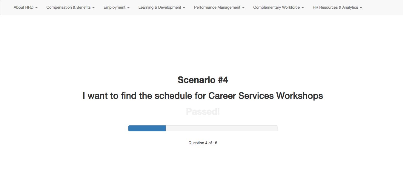
Though the latest version of the solution has been agreed upon, it would be ill-advised to implement and deploy it in production if it hasn’t been tested. Given the limited resources we have in terms of time we couldn’t schedule “focus groups” nor complex testing environments, which is why I decided to create a simple web application that utilizes click count as the metric to evaluate the integrity of our proposed structure.
The application is essentially a quiz app that presents the test-taker with use case scenarios. For instance, “I am an employee looking for a Career Development workshop”. After reading this use case the test-taker must utilize the navigation menu bar at the top to find the child-level page where he/she thinks the content related to the use-case is located. More than anything, this test measures the efficacy of the top-level navigation links, as those are the ones with higher abstraction and the ones that group and categorize the content of the information structure at all levels in the tree, often making them the harder ones to get right.
As the test-taker clicks around and “digs” for the right link, the application counts the number of clicks needed to fulfill and solve the current use-case/scenario. Ideally, and because the top-level links do not expose its children links on hover, the user should take between 2-3 clicks to find the right link. Anything above 4 clicks is worth reconsidering, and anything that takes above 5 clicks to find must be rearranged.
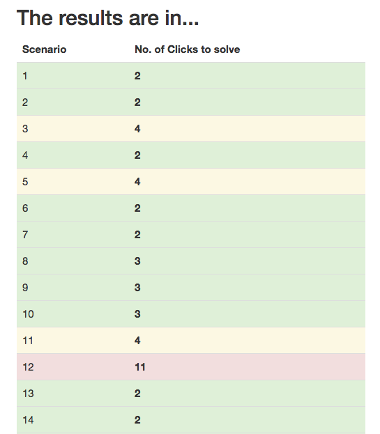
To help us with this analysis, at the end of the test, the application generates a color coded “Report Card” which lists each scenario and the number of clicks it took to solve the given use-case. Based on the scale I mentioned in the previous paragraph, each row is colored so that we can easily determine the use cases that were difficult to complete due to the current navigation structure.
This mock report shows how most use case scenarios can be easily solved with the current navigation structure. Scenario #12 however (red) shows we ought to make an adjustment.
This application is hosted on codepen.io so its code is open source by default. If you have a website structure that needs quick user testing you may fork the pen and modify it as you must. It has a jQuery and Bootstrap dependency but can easily be modified to use vanilla JavaScript if need be.