If there’s something that being left-handed has taught me is how product designers often forget that we are also part of the user base; perhaps because lefties (~10% of world’s population) are statistically marginal.
In my recent talk at the Inter-American Development Bank titled The All-Inclusive World Wide Web, I show how blind assumptions about users’ circumstances on the Web can alienate and exclude those in the low-end of the tech market, and explain how the path to inclusion in software begins by designing and creating with empathy.
The following post references a web application for testing the logic behind a website’s information structure. The app can be accessed here, and can be tinkered with here.
Perhaps one of the most daunting tasks when tackling a large-scale web design projects is figuring out how to organize the website’s content in such a way that it becomes intuitive for the “average” (if that even exists) user to navigate. Despite its apparent simplicity, this is a very challenging design process that requires shedding all biases and thinking as objectively as possible with the hopes of arriving at a semi-logical information architecture anyone can navigate through with ease.
I’m currently involved in a restructuring of a large Human Resources website for the organization I work for, the Inter-American Development Bank. The project came about because year after year, as new content was added and created, the current structure was not flexible nor scalable enough to accommodate the new content, which resulted in some information being buried, often many levels deep, without clear indication of where to find it. Sometimes even I, the person who is now in charge of updating the website, have trouble finding certain pages and bits of information.
This time, we wanted to get it right. We want to create an information architecture that is highly user-centered– that is, a structure that accommodates to the end goals of our target audience. In no way did we want this structure to reflect how the Human Resources department is internally organized. Rather, end-user motives and needs framed as use cases shaped the way we allocated the content pages within the hierarchy.
Solution
As expected, coming up with a solution was a highly iterative task that involved many people — from our small team, to various HR subject matter experts, to managers. Though the structure itself has not been approved as of the writing of this post, we did arrive at a core design characterized by a simple 3-tier hierarchy:
The first level provides the highest level of abstraction and each item in the menu represents a core HR area. In other words each top-level menu item corresponds to something HR does in a very general sense.
The second level is the bridge that connects the high-level core HR areas with the actual pages of content.
The third level is the webpage level and may further decompose into page subsections.
Testing the solution
Though the latest version of the solution has been agreed upon, it would be ill-advised to implement and deploy it in production if it hasn’t been tested. Given the limited resources we have in terms of time we couldn’t schedule “focus groups” nor complex testing environments, which is why I decided to create a simple web application that utilizes click count as the metric to evaluate the integrity of our proposed structure.
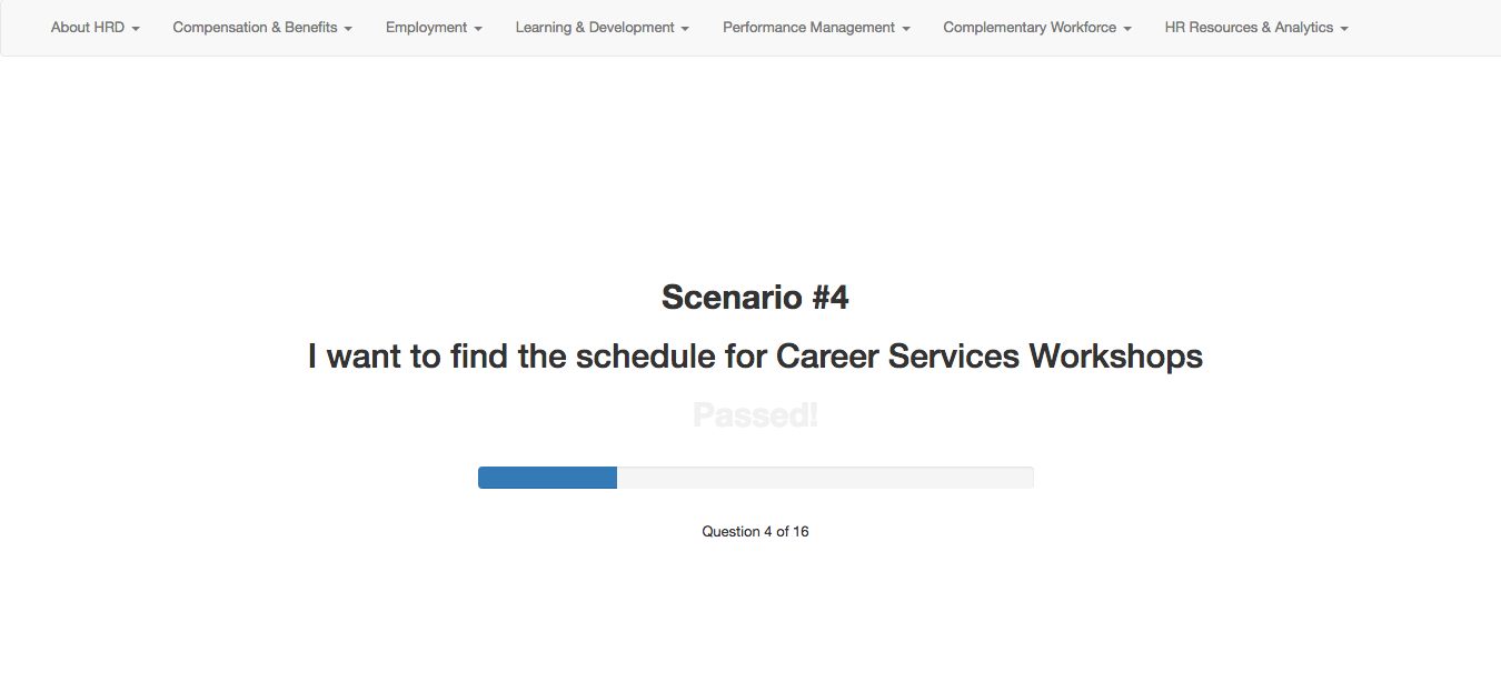
The application is essentially a quiz app that presents the test-taker with use case scenarios. For instance, “I am an employee looking for a Career Development workshop”. After reading this use case the test-taker must utilize the navigation menu bar at the top to find the child-level page where he/she thinks the content related to the use-case is located. More than anything, this test measures the efficacy of the top-level navigation links, as those are the ones with higher abstraction and the ones that group and categorize the content of the information structure at all levels in the tree, often making them the harder ones to get right.
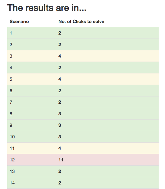
As the test-taker clicks around and “digs” for the right link, the application counts the number of clicks needed to fulfill and solve the current use-case/scenario. Ideally, and because the top-level links do not expose its children links on hover, the user should take between 2-3 clicks to find the right link. Anything above 4 clicks is worth reconsidering, and anything that takes above 5 clicks to find must be rearranged.
To help us with this analysis, at the end of the test, the application generates a color coded “Report Card” which lists each scenario and the number of clicks it took to solve the given use-case. Based on the scale I mentioned in the previous paragraph, each row is colored so that we can easily determine the use cases that were difficult to complete due to the current navigation structure.
This mock report shows how most use case scenarios can be easily solved with the current navigation structure. Scenario #12 however (red) shows we ought to make an adjustment.
This application is hosted on codepen.io so its code is open source by default. If you have a website structure that needs quick user testing you may fork the pen and modify it as you must. It has a jQuery and Bootstrap dependency but can easily be modified to use vanilla JavaScript if need be.