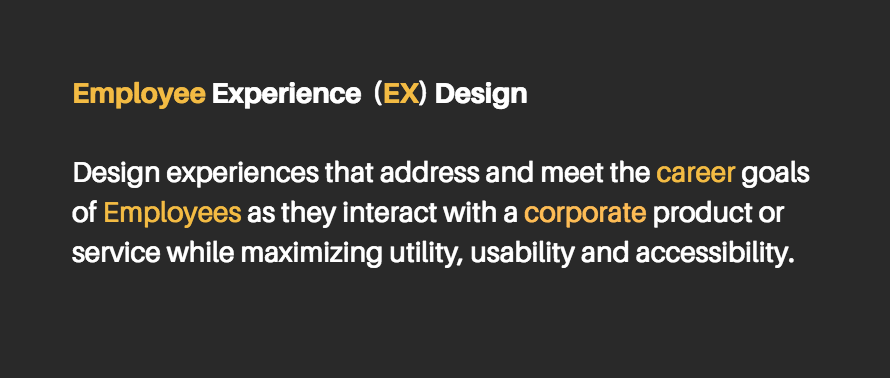
In the world of human resources, there’s the so-called Employee Experience (EX). This relatively new term refers to the all the continuous improvement with interactions and touch-points an employee has with the organization, specially with its corporate services (think HR services, IT services, corporate facilities, etc.) In theory, the better the employees’ experiences with these services are, the happier and more engaged they will be.
Still with me? Great.
If you think about it for a moment, these two terms have a lot in common and it’s not just the fact that they both compress the word “experience” to a letter X. No, what’s fundamentally similar is that the two concepts are about empathy, about putting people first. I like to think of them as the countermovement to the “bottom-line”. In our efforts to create efficiencies, to scale, to streamline, to standardize, and mass produce, we have forgotten about people. We create things because “that’s what the business wants”, but often fail to consider if “that’s what the customer needs”. So, given that these two concepts are fundamentally similar, what if we merged them in such a way that it is useful to address this disconnect between people and digital/organizational processes?
A framework is born
Las year I was involved in a huge website redesign project for the HR department of a large multilateral organization: the Inter-American Development Bank (IDB). We knew that the website had to be migrated to a more modern CMS platform, that we needed to have a “mobile-first” approach in development, and that we needed to catch up with new HTML5 standards. That was all well. However, I wanted to go beyond improving the technological infrastructure.
I wanted to use this redesign project as an opportunity to make HR knowledge less HR-ish. You know what I mean; less paperworky, less verbose, friendlier, smoother. In an attempt to compensate for the inescapable realities of the function’s inherent bureaucracy, I thought it was time to use UX design as the philosophy powering the content and interface design strategies of the website.
And so a framework was born: Employee Experience Design. I simply merged my experience and passion for UX design with the needs and goals of the employee. This wasn’t so much a tested methodology, but a perspective shift in our daily work on the project. The framework made everything much more concrete and focused. Now our team could make informed decisions about content strategy and information architecture concerns, taking the career goals of the IDB employee into account as its primordial source of value.
The new HR intranet website has been live for just three months at the time of this publication, so we’re still iterating on the effectiveness of some of our designs. However, I’d like to share with you three lessons we learned from the process that can help you create digital experiences for employees that are more fine-tuned to their needs.
1. Face it: No one wants to read your intranet website
If you create online content for employees I have something to say (are you sitting down? ): Let’s be honest, you’re not the New York Times, and you’re most definitely not the National Geographic. You’re more like the departures schedule at an airport: no one wants to read you, but sometimes they have to read you. And that’s ok. Just like a departures schedule is necessary to facilitate the travel goals of millions of air travelers (no one wants to miss their flight to Hawaii), you provide essential information to facilitate the realization of concrete career goals that employees have. You provide useful information; and that’s where your intrinsic value resides. Exploit it.

Learn to prioritize
If you’re in the business of providing useful information, you know that information saturation is often counterproductive. Many times less is more. That is something I had to constantly teach my clients in the HR department. Most people wanted all their hard work to be front and center throughout the website. All those comprehensive, 80-page reports and esoteric models for a particular HR initiative were impressive, but not at all useful to the employee who has 5 minutes in-between meetings to look-up something about some benefit her spouse asked her about. In a world constantly exploding with information, with social media applications craving people’s attention, the best course of action is to be deliberate in how you present content, making sure that what is objectively useful knowledge takes less effort to access.
For example, here’s how we organized the compensation section in the HR website, using what I like to call the “onion-model”.
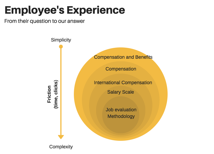
Here, we deliberately place the information that is most useful to employees at a higher level in the hierarchy (outer layers of the onion). And the more specific the information, the more friction the interface exerts on the user, which in this case is browsing time and number of clicks.
2. Test your information architecture with real users
One cannot stress enough the importance of a logical information architecture. It is in many ways the backbone of your site. How you organize your information should reflect the way a good number of your users think about the relationship between the topics in the knowledge you’re providing. Does it make sense to put On-boarding and Career Development together? What about workplace ethics? There’s only one way to know. Create a test group that are demographically similar to the personas outlined in your user-research (in our case it was easy since we tested it with a diverse group of colleagues) with real browsing scenarios and collect the data.
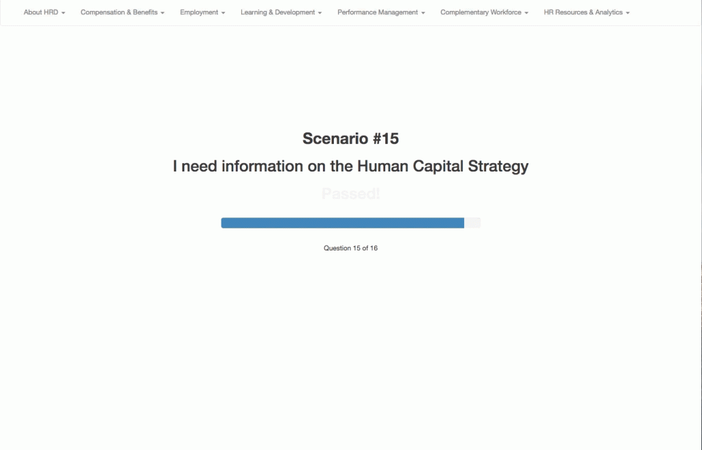
In our case, I developed an automated web application that counted the number of clicks it took someone to find the information the application asked them to look for. We used the number of clicks as an indicator of the efficacy and utility of the information architecture we were developing. Here you’ll find more information about my test application, and here you may have access my open source code for you to use in your own projects.
3. Simplify the complex
As we worked on a content strategy with our HR clients we quickly realized one thing: HR can be complicated and complicated is scary.
In an organization like the IDB there are many variables and characteristics that differentiate some employees from others, and thus the content that they would find relevant. Whether it’s the type of contract modality, the level of the position, the geographical location, or the nationality of the employee, these factors modify slightly the types of benefits, compensation, learning opportunities, and other HR services applicable to that employee. So, given complexity inherent in maintaining an HR function in a multinational organization, one must be able to present this information in a way that is quickly understood.
Get creative with filter interfaces!
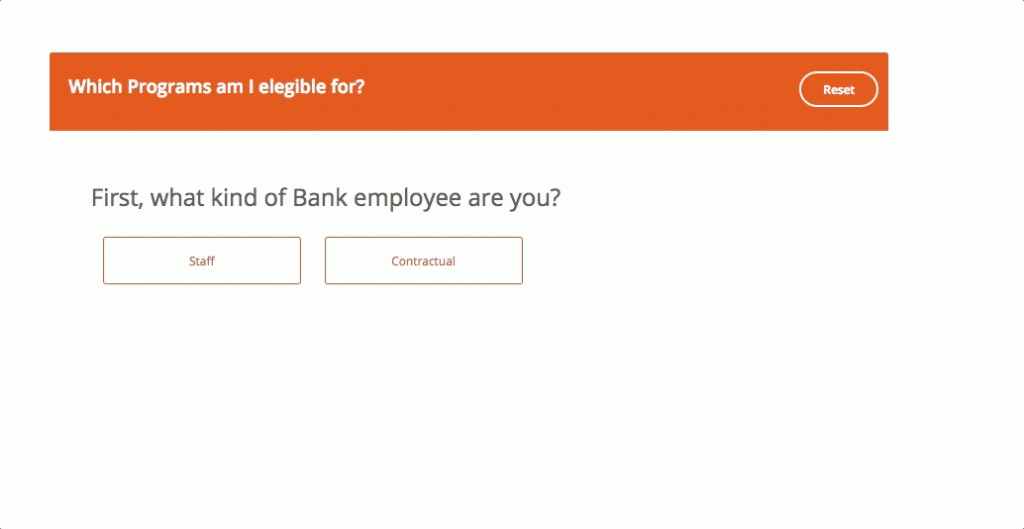
The use of filters are a great way to narrow down complex information. When the usefulness of certain knowledge is contingent with multiple variables, filters provide the user with clear input methods that help dig out what’s relevant to them. With one particular client, the leadership and employee development (LDV) unit, I decided to go a step further. I wanted to simplify the complexity in their content by adding a conversational layer to the interface in order to create a more natural and intuitive filtering experience.
LDV offers a wide variety of learning opportunities for the employee’s career development. In fact they have over 15 learning programs that cater to very specific employee types. Though the breadth of these resources was surely commendable, I had a simple follow-up question: how are average employees going to find the time to click through the website and find out which learning programs are available to them?
My answer to this question was creating a simple embedded quiz-app that asked a few questions to the user about the kind of employee they are, and based on that information the application outputs the names of the programs they are elegible for hyperlinked to their respective web pages.
Final Thoughts
HR has the responsibility to ensure a positive employee experience throughout the many interactions they have with the employees in an organization, both digitally and physically. Once HR creates digital spaces that clearly disseminate material aligned with the needs and career goals of the employee, the organization will see ROI in the form of efficiencies, efficacy in knowledge dissemination and overall employee engagement.